SafSav

I was tasked with designing a cloud storage app with only basic requirements and guidelines. Going through the design process step by step, my final product was SafSav - a cloud storage website with enhanced security and privacy geared toward tech professionals.

Invision Prototype
Home screen of SafSav

I Performed

I Used

Problem

I was requested by a client to target an unreached portion of the cloud storage market by designing a product that includes the features of saving web content, organizing content, creating content, and uploading files. I was also asked to consider including features like sharing items and connecting with other users for real-time collaboration in documents.

Solution

SafSav is a cloud storage app with security and privacy. User research found that tech professionals desire a product that will allow them to encrypt data that they upload and keep it private from the host company. SafSav does exactly that while also performing the expected functions of a cloud storage app including uploading, organizing, and sharing files. SafSav’s design became more polished, clear, and user-friendly as it went through multiple iterations based on two rounds of Usability Testing, Preference Testing, and feedback from senior designers.

Screens of SafSav
Screens of SafSav

Research

Competitive Analysis

Google Drive and Dropbox are big names in cloud storage while Pinterest has carved out its own niche by providing something unique. I performed a SWOT analysis of these three competitors.

Google Drive and Dropbox both provide the standard features that I had been tasked with including in the app. Both products also feature a simple, minimal, text-based UI that is easy to understand and navigate. I took note of their User Flows for basic actions; they are straight-forward and not too different between products.

The full SWOT analysis and all competitor User Flows are available at the link below.

Competitive Analysis
Competitor User Flows

User Research

What the user wants, the user gets

Next I sent out a User Survey to determine what cloud storage features users want in a product. Among other questions, I asked users to rate the desirability of features the client proposed at the start of the project. It turns out users didn’t necessarily want all of these features. With creating a manageable MVP as a goal, I decided to focus on the main features desired by users. The full User Survey results can be seen at the link.

User Survey

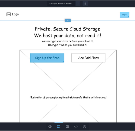
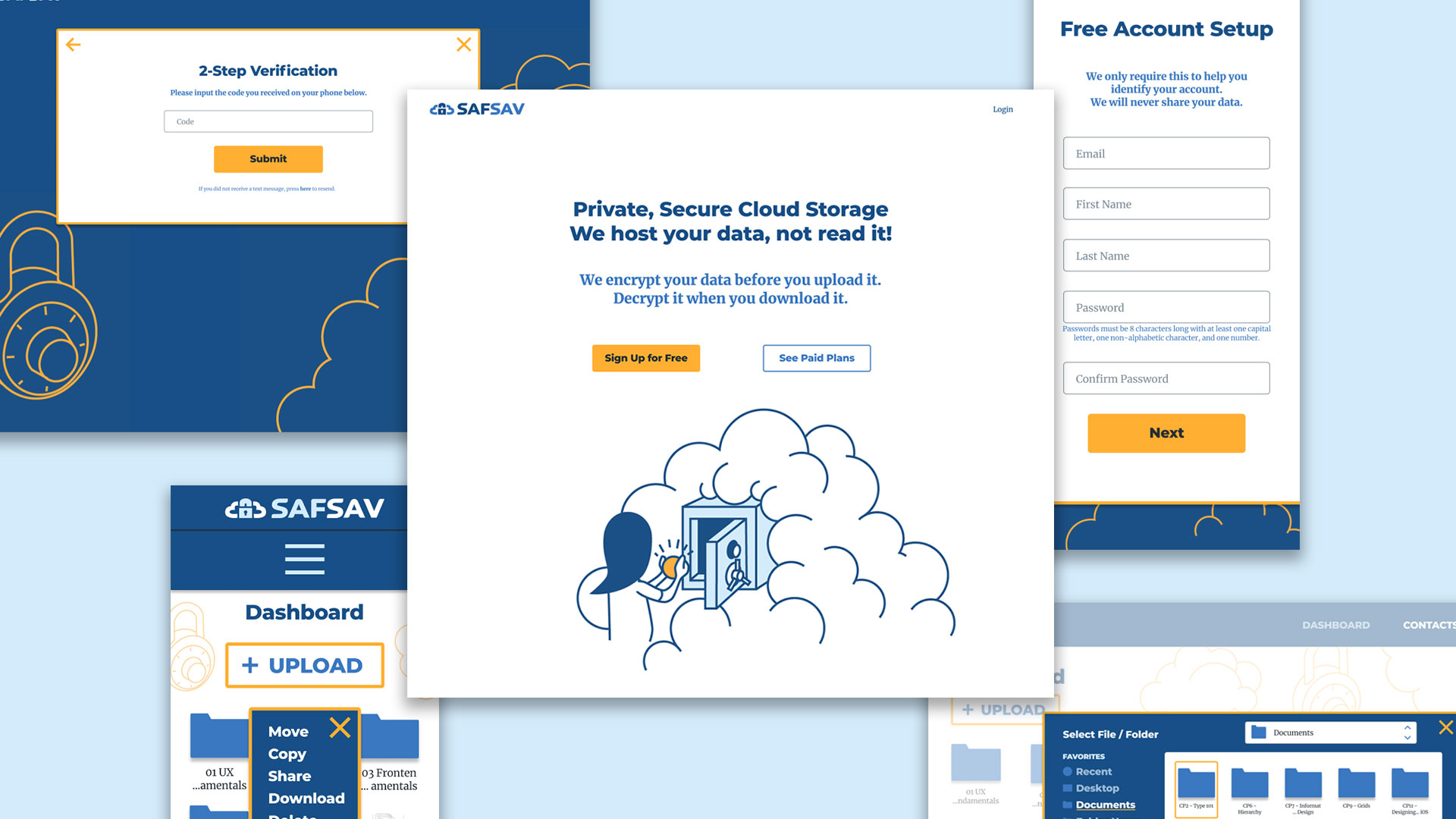
Interestingly enough, 60% of survey respondents came from a tech background (IT, Web Development, Network Administration, Security Specialist…), and when asked about what additional features they wanted in cloud app storage, several responded with comments about data encryption, privacy, and other security concerns.

With this product having no target audience at this point in time, it seemed like a great opportunity to focus on tech professionals who very clearly stated their desire for a cloud storage service with security and privacy. With this research, I now had a clearer direction and vision for the product.

User Personas

Putting a name and face to statistics

Now that I had determined a target audience for the product- tech professionals who want security - I focused user research on this group.

Pro Cloud User

Bryce

40 | Security Specialist
San Francisco, California
Photo of Bryce for User Persona

"I want to be able to sync my Linux and OpenBSD servers, my Macbook, my mom's RasperryPi, and my wife's Windows box."

Motivation

Bryce uses a variety of cloud storage apps for personal and work files. He uses some programs based on the recommendations of friends and others simply because someone he needed to share files with already used another program. For his work, Bryce must back up company data daily using cloud storage software.

Frustrations

  • ⁃ Doesn't trust companies with his data
  • ⁃ Some apps are insecure with too many breaches
  • ⁃ Unable to encrypt data easily

Goals

  • ⁃ Have software that is cross platform friendly
  • ⁃ Prevent host company from seeing or opening files
  • ⁃ Encrypt data before uploading

Bio

Bryce is happily married to his high school sweetheart. His daily job is a Security Specialist for his company involved in the Internet of Things. He enjoys engaging in volunteer work and contributing to different open source projects. With the rest of his spare time he can be found rebinding books from his classic book collection.

Retired Tech Professional

Simon

60 | Retired
Melbourne, Australia
Photo of Bryce for User Persona

“Don’t pretend to offer ‘unlimited’ storage, and make privacy and security major focuses.”

Motivation

Before retirement, Simon used various cloud storage apps for his work in programming and systems. He exchanged work files with co-workers and stored personal files for himself and his family. Currently he mostly backs up personal photos and videos and syncs files between tablets, phones, and computers for himself and family members.

Frustrations

  • ⁃ Vendors don’t offer reliable disaster recovery
  • ⁃ Doesn’t trust big companies with his data
  • ⁃ Companies don’t offer private hosting

Goals

  • ⁃ Have reliable access to data
  • ⁃ Host data privately
  • ⁃ Peer to peer sync

Bio

Simon is married with two children. He worked in programming and systems for almost 40 years before retiring. He now enjoys maintaining and modifying cars while also doing home renovations with his wife. He still keeps tabs on new and developing technology.

Info Architecture

User Stories

What shall this product do?

With the User Survey and more in-depth User Personas, I could now create User Stories to determine the types of tasks to include in the product. Using percentages and statistics from user research, as well as specific comments made by potential users, I compiled lists for new and returning users ranging between 40-50 tasks. Users wanted to perform a lot of the standard and collaborative tasks initially requested by the client with the important addition of data encryption. High priority tasks are displayed here with the full lists available at the link below.

User Stories

User Flows

How shall I accomplish tasks?

With my User Stories, I now had specific lists of potential tasks to include in the cloud storage app. With an MVP in mind, I focused on high priority tasks first. I used pen and paper to sketch rough versions of User Flows. I also referenced User Flows I created from the Competitive Analysis to see how competitors mapped out tasks similar to those I wanted. The process for onboarding, uploading files, moving files, and sharing files isn’t that different from product to product. An important distinction I had was including extra security measures and steps.

Based off of the rough sketches, I was able to create more refined User Flows using Draw.io. For onboarding, I did not include the option to sign up using social media sites like Facebook or Twitter. Because security is a major selling point of this product, I didn’t want to risk users’ data being in danger from potential security risks from social media accounts. I wanted to create a contained environment in which we and only we would determine the safety, security, and privacy for our users.

All User Flows can be viewed at the link below.

User Flows
SafSav User Flows

Wireframes

As with the User Flows, I started designing Wireframes with pen and paper first. I created 4-Up sketches for each screen I was going to need. I wanted to try different versions of each screen, but I also wanted there to be some sort of logical or visual consistency between each screen to make navigating the site as simple and clear for users as possible.

The early rounds of digital wireframes were made using Sketch. For inspiration and reference, I looked at the screens for other cloud storage sites like Google Drive, Dropbox, and OneDrive.

I designed more screens than were necessary in this first round, all of which can be seen here.

Wireframes
SafSav Wireframes

Prototype 1

It's alive!

I used InVision to create the first clickable Prototype using the digital Wireframes. This first Prototype had more functionality and screens than necessary for the MVP. However, designing these screens helped me to establish a layout that was consistent across the website. It wasn’t necessary to reiterate all of these screens in the later stages. The Prototype can be viewed at the link.

Wireframe Prototype
SafSav Prototype 1

Usability Test 1

I used the first Prototype in a Usability Test with three different users. Users were given three to four tasks, and they provided invaluable feedback for how to improve clarity and user-friendliness for the product. The full Usability Test Script, Notes, and Test Report can be viewed at the link below, and some changes made based on the tests are detailed below.

Usability Report 1
Change 1
When requesting a user’s phone number, indicate we won’t share it

With security being a major focus of the product, we indicated that we would not share a user’s name. However, in requesting a user’s phone number (for secure, 2-step verification), we did not state that we wouldn’t share a user’s phone number. One tester explained that she wasn’t comfortable sharing her number without knowing what we would do with it. On the first screen shown here, we indicate that we won’t share data. We should do the same for the second screen.

Input name screen from Sign Up Process
Here we indicate we won’t share a user’s name.
Input phone number screen from Sign Up Process
We should indicate we won’t share a user’s phone number.
Change 2
Give color or visual cues to “Upload” button

One user hesitated to click the “Upload” button, explaining that it appeared greyed out.

Upload button
“Upload” button appears greyed out and inactive.
Change 3
Give users navigation options when uploading new content

One user was momentarily surprised when he saw the modal window for uploading a file. He explained that he expected to see some sort of navigation to choose from where to select his file.

Upload file screen from Sign Up Process
There are no navigation options for selecting a file.
Other changes made for the next iteration include:

Visual Design

Mind Map and Sketches

Based on the user research I had conducted thus far, I now set out to build the brand for our cloud storage app. I built a Mind Map focusing on the keywords of “security”, “privacy”, and “cloud.”

I did more pen and paper sketches, this time to capture imagery related to the desired brand identity. Images include locks, safes, and clouds.

Photo of mindmap
Photo of cloud, safe, and lock sketches

Logo

Through ideation and sketching, I decided on the product name of SafSav. The cloud storage app would provide a safe way to save one’s data to the cloud. I worked on designing a logo representing both security and the function of saving data to the cloud. The name SafSav is visually and aurally balanced with a pair of three letter words both starting with “Sa-”. The “s” shape also has curves that would work well with the image of a cloud.

Early SafSav logo sketches
Digital SafSav logo variants
The logo mark represents security and a cloud to indicate the product’s function.

This first logo was based off of Lato Black, a typeface with a thick stroke to convey strength and security. I therefore chose Lato Black as the main brand typeface and used all caps to further communicate strength. As I was also considering Montserrat ExtraBold, a senior designer noted that Montserrat was a stronger looking typeface. I therefore made a second logo based off of Montserrat ExtraBold. I had to redo the brand mark as well to match the stroke width of the new logo type.

SafSav logo based off of Lato Black
SafSav logo based off of Montserrat

Raleway was originally chosen as the secondary typeface to complement Lato Black. The same senior designer who recommended Montserrat also suggested that I use a serifed font to provide more contrast with whichever san-serif I chose for the main typeface. I therefore went with my backup option of Merriweather.

Raleway

Merriweather

Style Guide

I designed a Style Guide detailing the logo usage, brand typefaces, and brand colors. All design choices including the logo design, thick typeface, and extensive use of blue were made to convey the brand values of security, strength, dependability, and professionalism. Yellow / orange was added as a contrast to the different blues that serve as the main product color. This complementary yellow / orange could be used to draw attention to CTAs or other clickable elements.

Style Guide
Style Guide showing SafSav logo usage

Hi Fidelity Mockups 1 of 3

Starting to look like an actual website

Using Figma, I was now able to apply the Style Guide to the user-tested Wireframes.

Desktop Screens Version 1 of 3
Desktop screens of SafSav
Mobile Screens Version 1 of 3
Mobile screens of SafSav

Preference Test

The user is never wrong.

Using Usabilityhub.com, I conducted three preference tests to get user feedback on different design elements. Though I was drawn to design choices that were unique or internally consistent, users preferred other options based on clarity and ease of use. I edited the tested design elements on the mockup to reflect the users’ most popular choices.

This was a valuable experience for me to learn that user-centered design is about creating something easy to use, not necessarily what is prettiest or most creative.

Two of the items I tested are featured here.

Preference Tests for SafSav

Prototype

Hi Fidelity Mockups 2 of 3

Have to admit it’s getting better...

A senior designer reviewed the first Hi Fi Mockups and suggested some revisions. I added more yellow / orange to the overall design via borders on modal windows and more line illustrations. I adjusted the logo and headline size on the homepage to make the headline more prominent. I also added drop shadows to modal windows to help separate them from the backgrounds, and I changed the appearance of the dashboard file thumbnails and filenames to look more realistic. Lastly, I applied changes to reflect the most popular choices from the three Preference Tests.

Desktop Screens Version 2 of 3
Desktop screens of SafSav
Mobile Screens Version 2 of 3
Mobile screens of SafSav

Usability Test 2

Using the updated Mockup, I created a second Prototype in InVision. Once again, a Usability Test was conducted with three users. Though I expected this second round of testing to result in minor tweaks, some significant changes were made thanks to insightful feedback from test-takers and my lead designer. The full test report can be viewed here.

Usability Report 2
Change 1
Simplify the Sign Up Process

All three test-takers commented on the many steps of the onboarding process. I followed a user’s suggestion to make a user’s email address serve as their username. This helped me to eliminate a step in the sign up process. More guidance was add for users via instructions. Back arrows were added and “Submit” was changed to “Next” to increase user-friendliness. All modal windows were moved to the “New Account” screen to make the process more unified.

Old Sign up page
The sign up process used to start on the homepage.
New Sign up page
I moved the entire sign up process to the “New Account” page.
Change 2
Redo the “Select Recipients” Modal

A couple of users experienced confusion with the modal window for selecting recipients with whom to share files. Though I addressed this problem after the first user tests, it seems my first solution needed work. The new modal has only one input field making it clear to users where to click. Additional options appear after the initial input.

Old modal window for sharing files
Old Modal Window
New modal window for sharing files
New Modal Window
Change 3
Change Navbar Links

Text color was changed on the navbar to be consistent with other text links and a horizontal line was added to let users know what screen is currently active.

Old navbar
Old Navbar
New navbar
New Navbar
Change 4
Add Overlays Behind Modals

White transparent overlays were added behind all modal windows, clarifying to users where they can click

Dashboard options screen with white overlay in background
White overlay behind modal window

Final Prototype

The latest and greatest SafSav prototype can be found here.

InVision Prototype
Screens from final version of SafSav

Conclusion

After hours, days, and weeks of research, sketching, designing, testing, reiterating, and more testing, I have come to the current version of SafSav.

What Worked?

RESEARCH

User Surveys proved to be very beneficial in providing a focus on security for this product. Researching User Flows for competitors was also helpful in guiding me on what screens and modal windows to create.

What kind of worked?

BRANDING

Though I made a change in brand typefaces and the logo type, the overall look and color scheme of the brand identity did not change much. Users responded positively to the line illustrations of the final design, but one user commented on how they felt fun, which is not fully in line (though not necessarily against) the desired image of security, safety, and professionalism. Feedback from senior designers, Usability Tests, and Preference Tests helped me to fine-tune visuals and specific elements of UIs.

What didn’t work?

CONTENT STRATEGY

Perhaps the biggest changes made throughout the design process were to the sign up, upload, and sharing processes. As each of these processes has multiple steps including typing in information and selecting items, there were several places and opportunities for users to be confused. A more in-depth study of how competitors conduct similar processes could have been done, but Usability Testing was the best and most direct way to determine what worked and didn’t work for this particular product.

Stages of three different screens from early sketch to final version
The evolution of three different screens

Mobile App?

Though I am satisfied with the testing of the Desktop version of SafSav, I was unable to test the Mobile version. I made edits to the Mobile version based on changes made to the Desktop version, but it is entirely possible that mobile users will have a different experience and different preferences. I would conduct Usability Tests using the Mobile version if I had more time on this project.

User input helps. A lot.

The initial project brief was a bit overwhelming in that it was an open-ended project with no clear target market. Starting with the first User Surveys, user input helped to narrow the scope of the project and point me toward data security. The rounds of Usability Testing revealed tasks, instructions, or processes that were not clear to users. This helped me to see and realize things I could not surmise on my own. The Preference Test helped me to make design decisions that were challenging to make based solely on my opinion. In a couple of Preference Tests, users made choices different than what I would have made, but there was such a statistical consensus that it made it clear that I should apply the user-prefered choice.

Final thoughts

It was both challenging and fun to design SafSav from start to (sort of) finish (is a living app ever truly finished?). As a task-oriented introvert, it is natural for me to work in solitude on meticulous design work, but turning to users for input throughout the process was invaluable in forcing me to step back, breath, and hear perspectives and opinions that differ from my own. Likewise, the feedback from more experienced designers was also incredibly helpful. I am certain that moving forward and working on future projects, I will continue to seek out and reap the benefits of outside perspectives.